Data visualization and infographics resources for design inspiration
Infographics or Information graphics is mode of visual communication of information using graphics. Like maps, technical writing, flowcharts, scientific visualization, process visualization etc. They can be very good resources of inspiration for various design jobs as they solve communication problems using easy to understand graphics which can be small icons, pictograms or pictures.
Visualizing Fitt's law - Particle Tree Published in 1954, Fitts’s Law is an effective method of modeling the relationship of a very specific, yet common situation in interface design.
21 ways to visualize and explore your email inbox - Flowingdata This article gives information on visualizing your email inbox using various visualization tools.
17 ways to visualize twitter universe - Flowingdata Twitter as we all know is very simple yet very useful social media tool which keeps us updated on what others are doing and show others what you are doing. There are some really cool tools out there for visualizing different types of data of your twitter account like network diagrams, analytic information etc.Like for example Tweetstats shows analytics data of your twitter account.
Visualizing Del.icio.us Roundup - Solution Watch List of tools for visualizing del.icio.us account with description And for del.icio.us users you can visualize your del.icio.us tags and bookmarks on Sixpli (requires flash) webapp.
Creating accessible charts using canvas and jquery - Filament Group This is one of nice articles on data visualization in HTML using Javascript and API's.
New York Talk Exchange illustrates the global exchange of information in real time by visualizing volumes of long distance telephone and IP (Internet Protocol) data flowing between New York and cities around the world.
Stephen P. Anderson designed a very nice Pdf poster on Sorting, Classifying, and labeling experiences you can download it from here. (~3mb) or letter sized pdf here (~450kb) (Printable version)
John Emerson's pdf booklet on Visulaizing Information for advocacy can be downloaded freely from here. (~7mb)
Some demonstration infographics by Funnel Incorporated in Jpegs format.
Dna11 offers personal DNA portraits as modern art.
Designing visualizations for time based data by Interface designer Max Kiesler
Visualization Programming languages, Software and toolkits also by Max Kiesler
Web market trend map 2008 from Informationarchitects
23andme' Infographics on effect of taste of broccoli on different genotypes. Available in pdf format too.
Six cool infographics maps on major current world issues from Princeton.
Skill set for Interaction Designers
Baseball Pitches Illustrated - A fan's guide to identifying Pitches by Lokesh Dhakar Download it in pdf format. (~149kb) and his take on Espresso Drinks here.(~359kb)
Chris Harrison's Visualization projects. Some cool visualization projects here like wikipedia top 50 visualization and Internet map - City to city connections .
Good Magazine Transparency - A graphical Exploration of data that surrounds us.
Curriculum Vitae by Dizzia Creative modern art approach at designing CV with help of infographics along timeline.
Survey of Design Salaries for 2007 and 2005 year by Aquent-AIGA in pdf format are available for download freely.
Touchgraph Facebook browser lets you visualize friends and photos.
Food Pairing of tastes of 250 different food products.
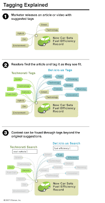
Tagging explained using Infographics (pdf version)
Google Page Rank explained (pdf version)
Link Blazing to good Neighborhood (pdf version)
Lifemap of Ritwikdey It is visualization life of Ritwikdey of age 6 to 24. Good use of colors and information.
SIMILE - Welkin Project - MIT Welkin is a graph-based RDF visualizer.
At Albertocairo you can download his work on Visual Journalism : Multimedia Infographics In pdf formats. (Unedited) and some other pdf's for more knowledge.
Google Visualization API With this API you can display structured data and embed visualizations into your website, edit, read and retreive it, share it and use different data sources to create new visualization applications.
5 cool concept diagrams on topics like user experience design, flickr user model etc.
Social Media information Flow by Andrew Shuttleworth It visualize how information gets circulated through social networking and media sites. Available in pdf, png, mmap or xml file.
Crimespotting (Requires Flash) uses crimewatch data to show information about criminal activities occured in specific area with help of maps.
Chris Jordan's way of saying things with infographics .
Wordcount shows 86,800 most frequently used english words.
Processing is an open source programming language and environment for visualization of data.
Alquimia Mx7 shows information of tastes of different fruits.


.pdf+(1+page).jpg)


